Typography for a Design Classic
- Creative Fields Typography
- Semester 1.
- Years 2012/2013
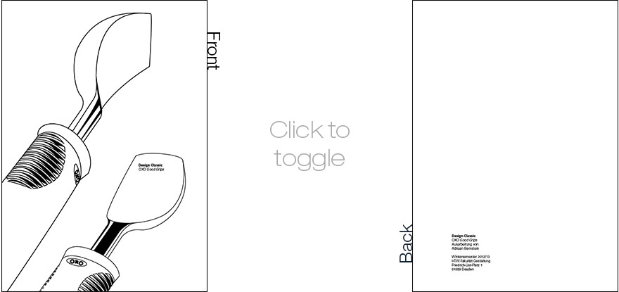
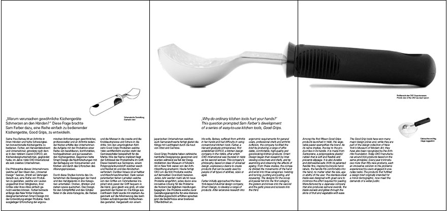
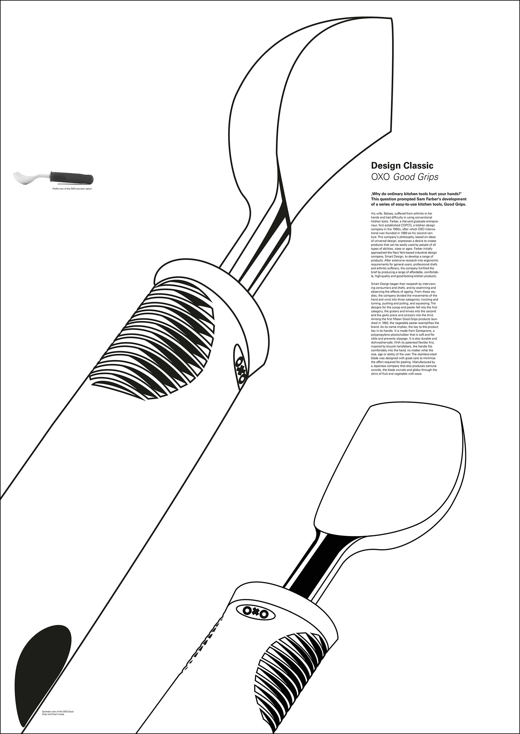
The very first Typography project in my studies. It was meant to provide a basic understanding of what typography is, what the relevant factors are and how to use them. A foldout sheet and a poster for a randomly assigned object, in my case an OXO Good Grips ice-cream spoon, had to be designed only using text elements and black and white vector graphics.
This project also provided an introduction to Adobe Illustrator and InDesign.


